Note
Click here to download the full example code
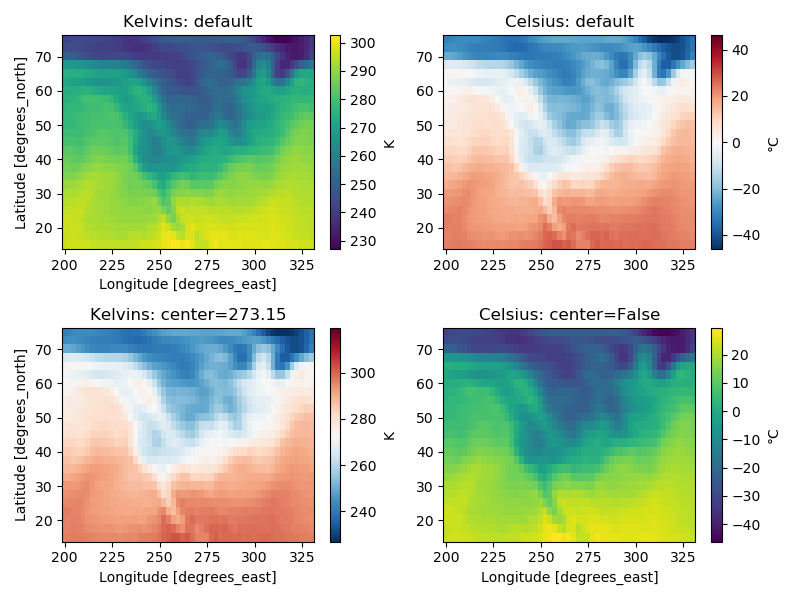
Centered colormaps
xarray’s automatic colormaps choice
import matplotlib.pyplot as plt

import xarray as xr

# Load the data
ds = xr.tutorial.load_dataset("air_temperature")
air = ds.air.isel(time=0)

f, ((ax1, ax2), (ax3, ax4)) = plt.subplots(2, 2, figsize=(8, 6))

# The first plot (in kelvins) chooses "viridis" and uses the data's min/max
air.plot(ax=ax1, cbar_kwargs={"label": "K"})
ax1.set_title("Kelvins: default")
ax2.set_xlabel("")

# The second plot (in celsius) now chooses "BuRd" and centers min/max around 0
airc = air - 273.15
airc.plot(ax=ax2, cbar_kwargs={"label": "°C"})
ax2.set_title("Celsius: default")
ax2.set_xlabel("")
ax2.set_ylabel("")

# The center doesn't have to be 0
air.plot(ax=ax3, center=273.15, cbar_kwargs={"label": "K"})
ax3.set_title("Kelvins: center=273.15")

# Or it can be ignored
airc.plot(ax=ax4, center=False, cbar_kwargs={"label": "°C"})
ax4.set_title("Celsius: center=False")
ax4.set_ylabel("")

# Mke it nice
plt.tight_layout()
plt.show()
Total running time of the script: ( 0 minutes 0.679 seconds)